I lead the experience design in an ambitious, time-limited project to not only align the Sky Sports app (Android & iOS) with the new Sky Sports TV channels, but also incorporate new features.
Initial research
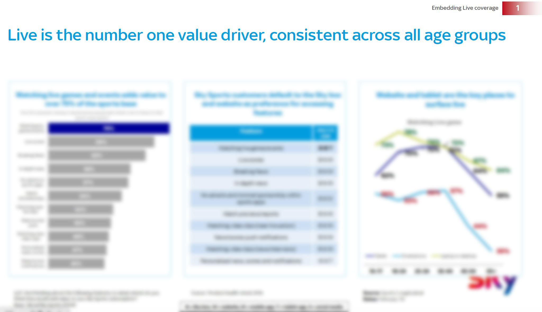
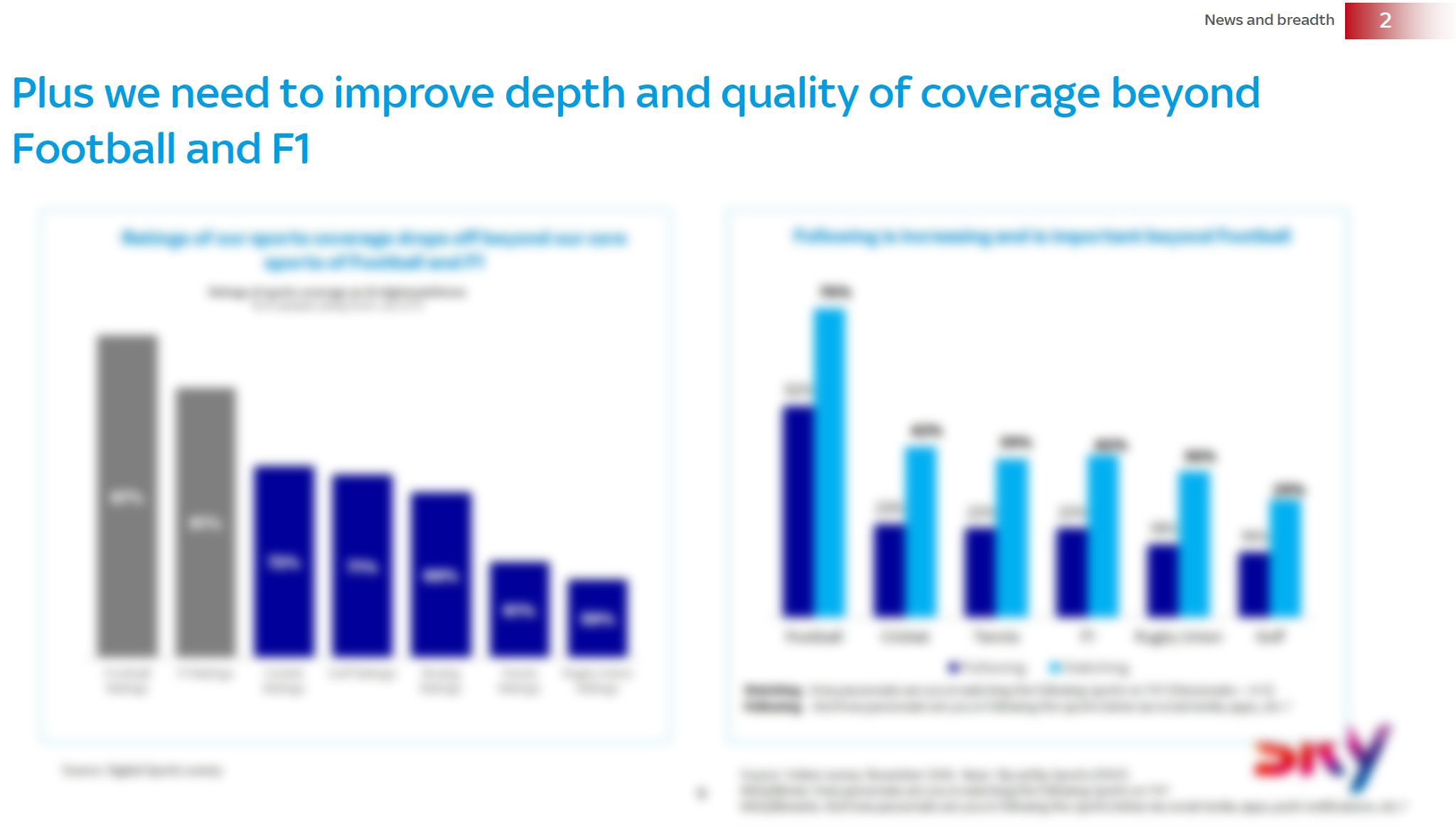
I planned, ran, analysed and reported on a number of customer surveys and user interviews to assess current satisfaction levels for Sky Sports' digital products and uncover insight to lead new developments.
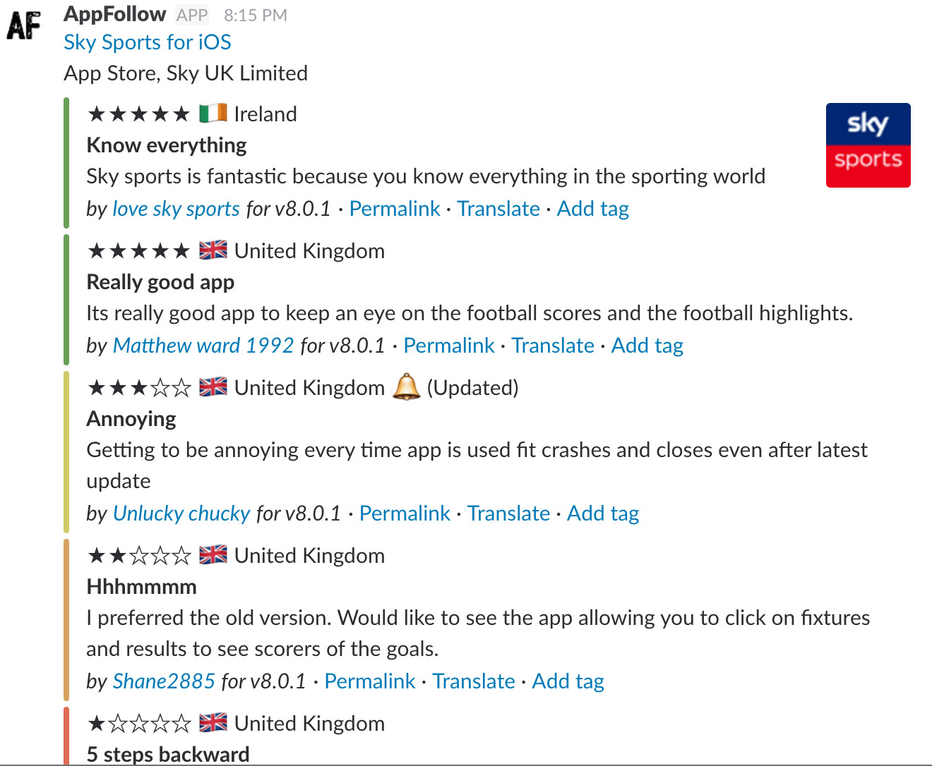
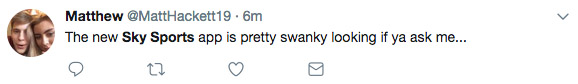
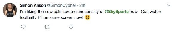
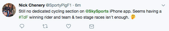
I also assessed reports made by Sky's insight team (IDS) as well as user sentiment via app store reviews and Twitter feedback.
Ideation
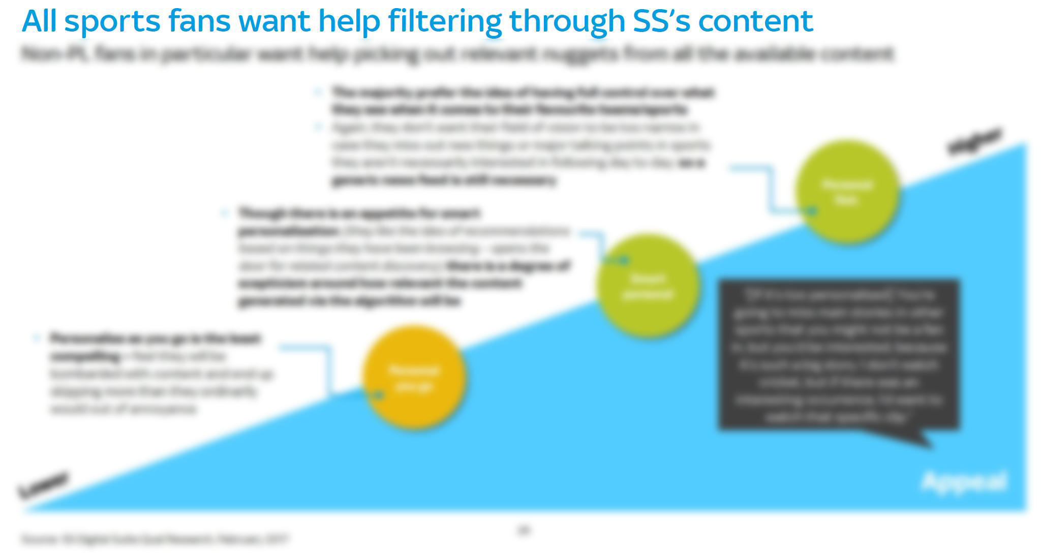
Next I identified the key problem and opportunity areas, facilitating a discovery workshop with stakeholders, using the research findings to generate ideas and assumptions to test.
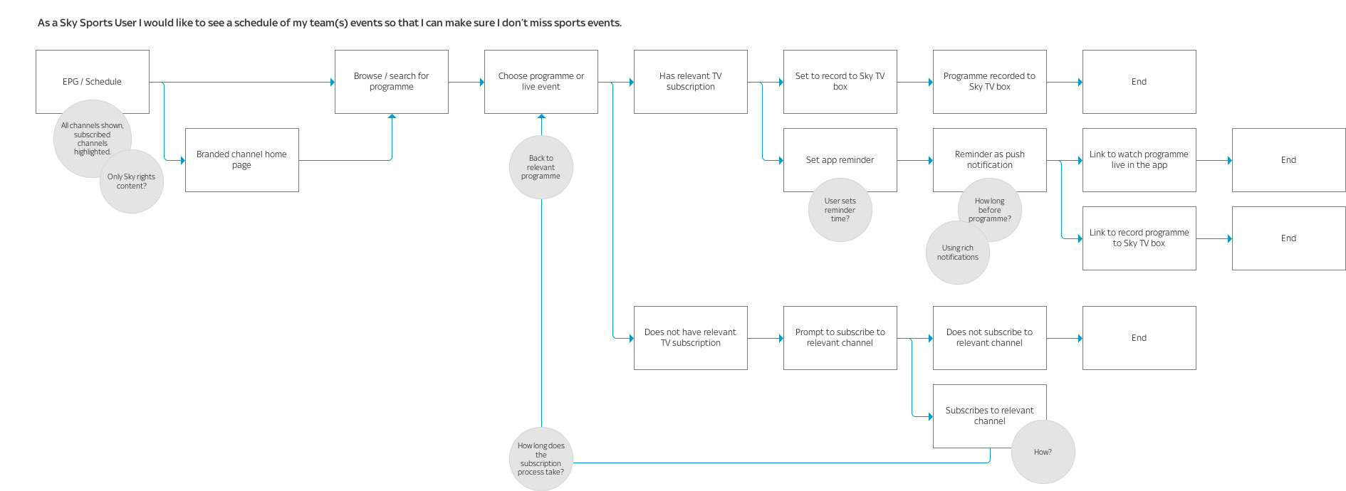
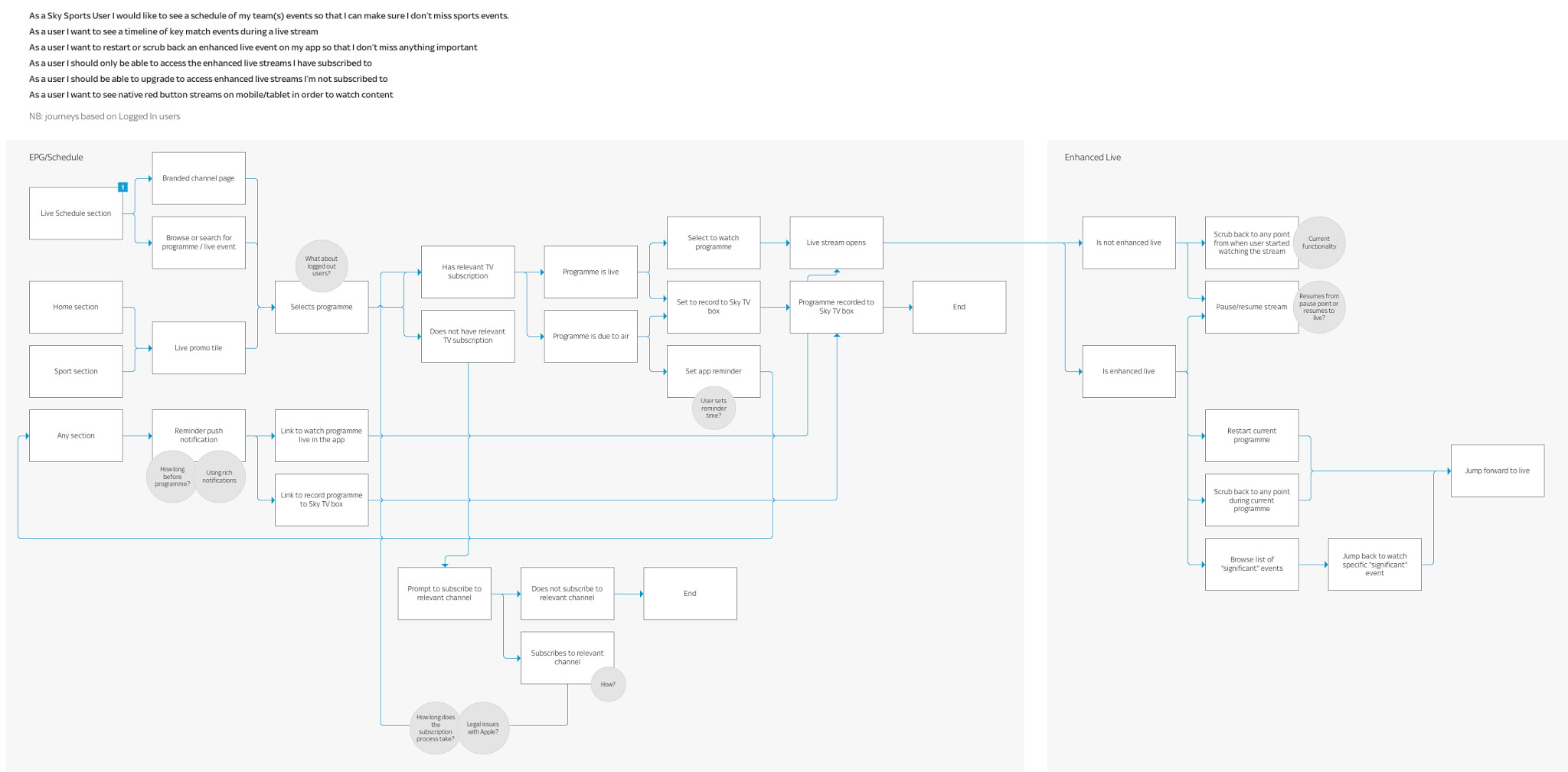
User journey maps
To start to bring some of the ideas to life, I mapped out the user journeys which detailed how the features could be incorporated into the existing product. This helped the team to understand the effort versus value that each idea might have on the project goals, enabling easier prioritisation.
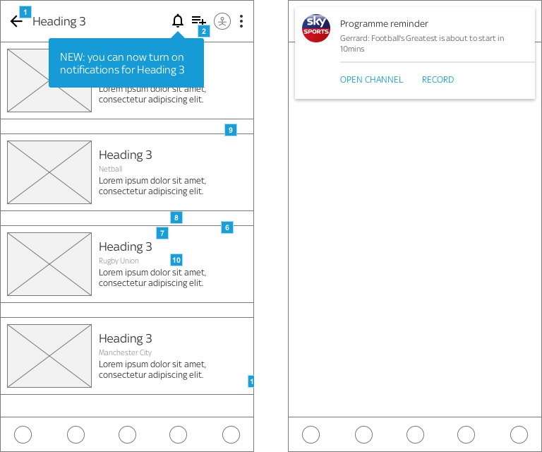
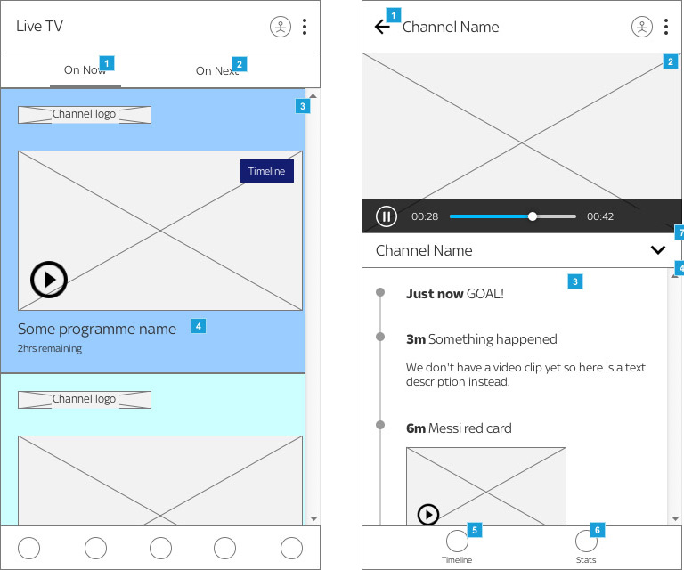
Wireframing (Axure)
The next step was to visualise the layouts and user interface to begin to shape the prototype for user testing.
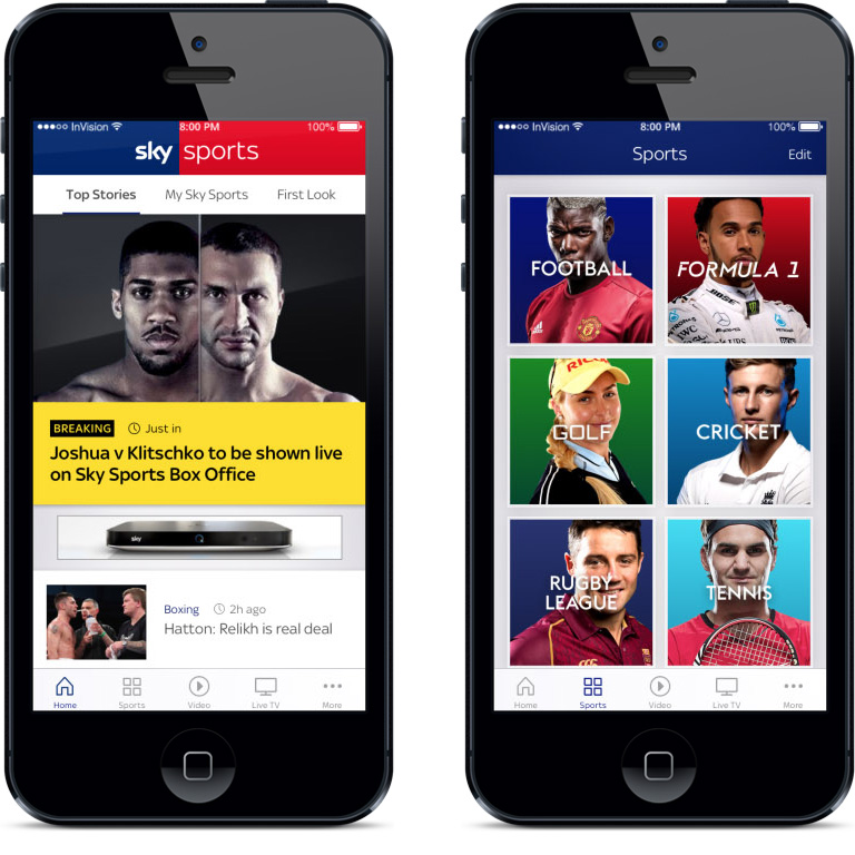
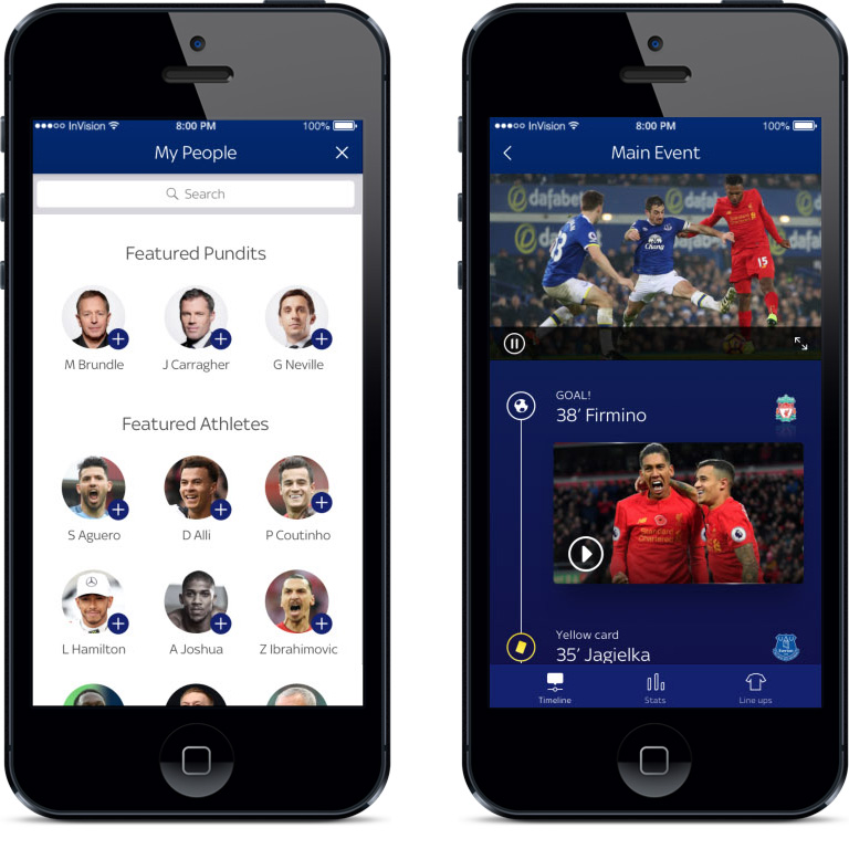
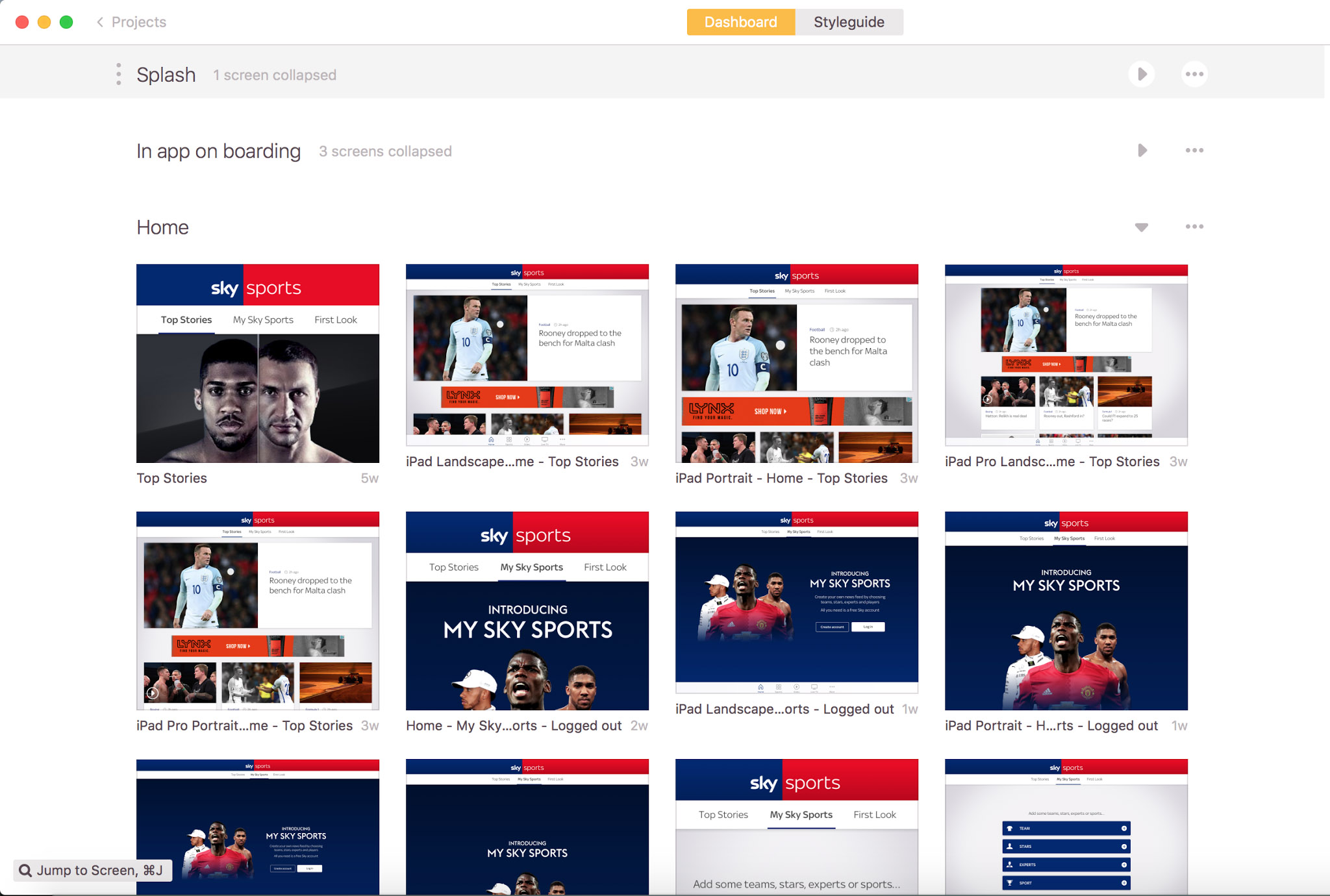
Prototype design (Sketch & Invision)
To validate the new features and designs I worked with the UI team to create prototypes to be put in front of real users. These designs utilised existing Sky Sports branding and style toolkits that our team had developed.
User research
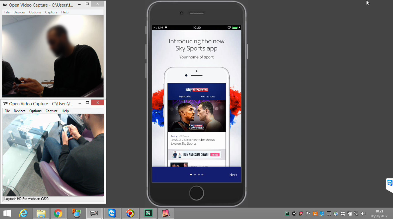
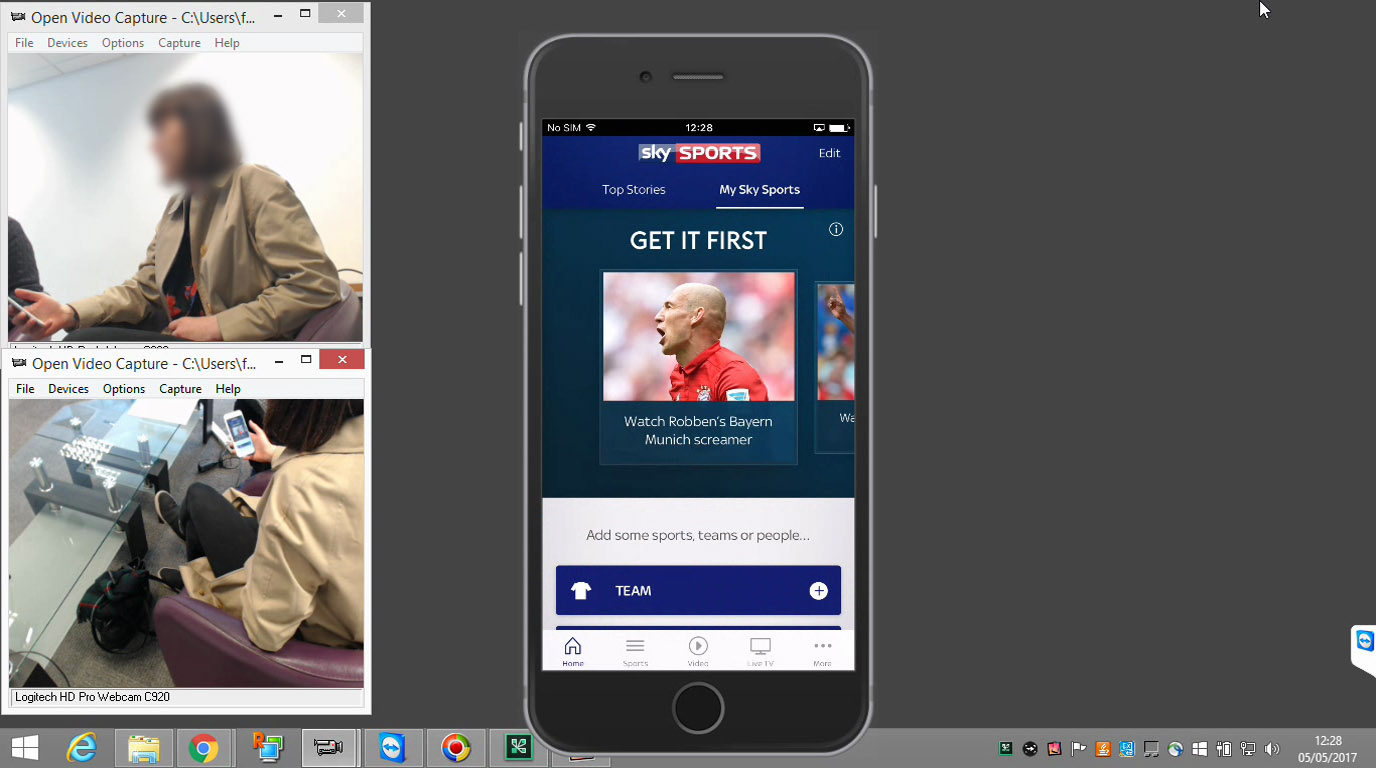
I planned and moderated 2 days of user testing in London, assisted by Sky's internal research team who recruited the participants and booked the research lab. We put the prototypes through their paces, getting feedback and finding areas for improvement. As always we came away with lots of feedback to incorporate into the next iterations.
Design iteration
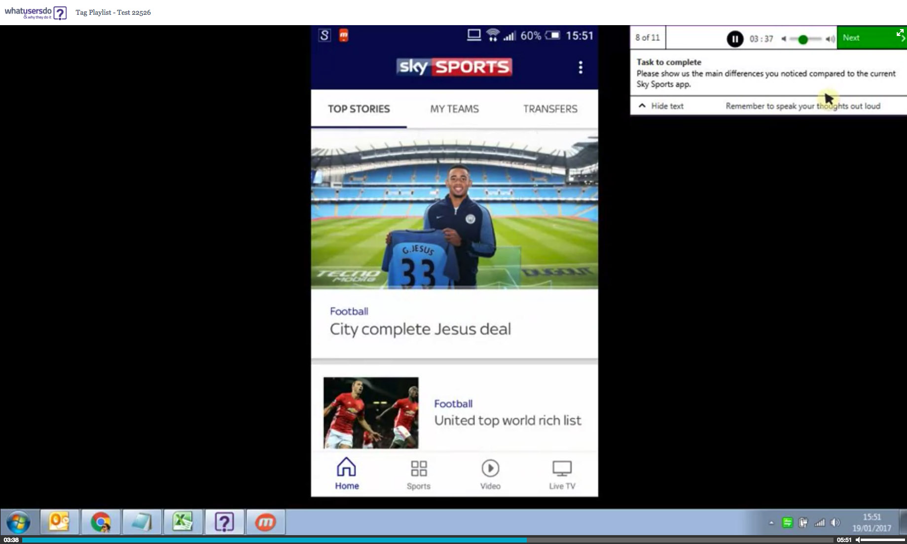
Following a number of tweaks to the UI designs which incorporated the feedback we received, I conducted a number of remote, unmoderated usability studies (What Users Do) which were quick and low cost compared to the moderated lab research.
These allowed the team and myself to quickly assess what was working or not, iterating further until we were happy with the experiences we had designed.
Build support
The UI team then "filled in the blanks" by providing the remaining designs and interactions.
By involving them closely with the user research, they already understood the rationale behind much of the decision-making.
The designs were handed over to the developers using Zeplin. I attended their Agile planning sessions and standups, being on hand to explain the detailed workings and interactions for each feature.
Measurement
Once live, I captured user sentiment in a number of ways (Twitter, App Store reviews, surveys, analytics) to find out how the changes were being received and identify any issues.
Within a few weeks, our analytics (Adobe Omniture) were showing pageviews per visit up by 12% and logged in users up 8%.